Unity in <a href="https://homesteadhug.com/modern-art-deco-interior-design/”>interior design isn’t about making every room identical, it’s about creating visual threads that tie your home together without dulling its personality. A house with strong unity feels intentional, not accidental. You walk from room to room and sense a connection, even when the kitchen’s farmhouse style flows into a mid-century living room.
Understanding unity principles helps homeowners avoid the catalog-showroom look where nothing talks to anything else. It’s the difference between a collected home and a cluttered one.
Table of Contents
ToggleKey Takeaways
- Unity in interior design creates visual threads that tie your home together by intentionally repeating design elements like colors, materials, and shapes across rooms without demanding uniformity.
- A consistent color palette of three to five hues, applied using the 60-30-10 rule, is the fastest way to establish unity and should flow through adjacent spaces even when proportions shift.
- Material and finish repetition, such as using the same hardwood species or metal finishes across rooms, is especially effective in open-concept layouts for tying disparate spaces together.
- Unified interiors improve how spaces function emotionally and functionally while boosting resale value, as homes with cohesive design schemes photograph better and appeal to more buyers.
- Common unity mistakes include mixing too many wood tones, ignoring undertones in paint selections, introducing random accent colors, and purchasing décor piecemeal without an overarching design scheme.
- Creating a mood board with paint swatches, fabric samples, and finish samples before purchasing prevents expensive mistakes and ensures every item reinforces your established unity design framework.
What Is Unity in Interior Design?
Unity is the design principle that ensures all elements in a space, or across multiple spaces, work together toward a cohesive visual experience. Think of it as the grammar of a room: individual pieces might be beautiful, but without unity, they’re just words scattered on a page.
In practical terms, unity means your color palette, materials, furnishings, and architectural details share common threads. A home with good unity might repeat warm oak tones in flooring, cabinetry, and furniture legs. Or it might echo curves, arched doorways, rounded mirrors, barrel chairs, throughout the first floor.
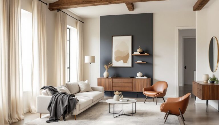
Unity doesn’t demand uniformity. A unified space can mix styles, eras, and price points. What matters is the intentional repetition of design elements that signal “these things belong together.” It’s why modern art deco spaces can blend geometric patterns with plush textures and still feel pulled together, geometric motifs repeat across rugs, light fixtures, and trim details.
The opposite of unity is chaos: rooms that feel like they were furnished by five different people who never spoke to each other. No repeating colors. Clashing wood tones. Styles that jar instead of complement. Unity fixes that.
Why Unity Matters in Your Home
A unified interior improves how a space functions and how people feel in it. Humans are pattern-recognizing creatures, we’re calmed by visual consistency and stressed by discord. When a home has unity, the brain doesn’t work as hard to process competing visual information.
Resale value benefits, too. Real estate agents know that homes with cohesive design schemes photograph better and appeal to more buyers. A house where the tile in the bathroom echoes the backsplash in the kitchen, or where trim color stays consistent across floors, reads as “well-maintained” and “thoughtfully designed.”
Unity also makes decorating decisions easier. Once you’ve established core elements, say, a palette of navy, brass, and white oak, you have a filter for every purchase. Does this lamp fit the scheme? Does that rug reinforce it? The framework prevents expensive mistakes.
For DIYers tackling multi-room projects, unity is the difference between a home that feels finished and one that feels perpetually “in progress.” It’s the reason industrial interiors can pair concrete floors with reclaimed wood and metal fixtures without looking like a hardware store exploded, the raw material palette repeats, creating harmony.
The Core Principles of Unity Design
Color Harmony and Consistency
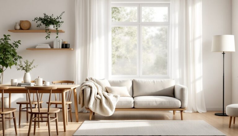
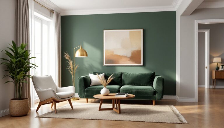
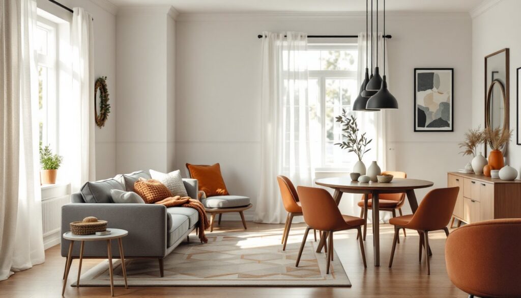
Color is the fastest way to establish unity. A consistent color palette, typically three to five hues, should flow through adjacent rooms, even if proportions shift. Your living room might be 60% warm gray, 30% rust, and 10% charcoal, while the hallway flips to 60% charcoal with rust accents. The colors repeat: the ratios change.
Use the 60-30-10 rule as a starting framework: 60% dominant color (walls, large furniture), 30% secondary color (upholstery, rugs), 10% accent color (pillows, art, accessories). This prevents any single color from overwhelming the space while maintaining visual threads.
When selecting paint, test samples in multiple lighting conditions, north-facing rooms skew cool, south-facing warm. A greige that looks perfect in the paint store might read lavender under your LED recessed lights. Buy quart samples, paint 2′ × 2′ swatches on different walls, and live with them for a few days.
For multi-story homes, consider a vertical color transition: lighter, airier palettes on upper floors, grounding darker tones on the ground level. This mimics how homify recommends using color to create visual flow in furniture selection.
Repetition and Pattern Techniques
Repetition doesn’t mean duplication. It means echoing shapes, textures, materials, or motifs in varied ways. If your dining room has a geometric tile floor, repeat geometric patterns in the living room rug or throw pillows, not the exact same pattern, but the same visual language.
Material repetition is especially effective in open-concept layouts. Use the same hardwood species (or a close match) across living spaces. If you install quartz countertops in the kitchen, echo that material family, not necessarily the same slab, in the bathroom vanity. Repeating metal finishes (brushed nickel, matte black, brass) across faucets, cabinet pulls, and light fixtures ties disparate rooms together.
Texture creates unity through contrast. Pair smooth surfaces (glass, polished stone) with rough ones (jute, raw wood, linen). But keep the texture families consistent: if you’re using nubby, organic textures in the living room (chunky knit throws, seagrass baskets), don’t jump to glossy lacquer finishes in the dining room. The tactile language should stay cohesive.
Pattern scale matters. Mix large, medium, and small-scale patterns within the same style family, florals of different sizes, stripes in varied widths, geometrics at different scales. This adds visual interest without breaking unity. A common DIY mistake is using all same-scale patterns, which flattens the design.
Practical Ways to Achieve Unity in Every Room
Start with architectural trim. Keeping baseboard, casing, and crown molding profiles consistent across floors creates automatic unity. Standard residential trim is 3¼” baseboard and 2½” casing, but if you upgrade to 5¼” baseboard in one room, carry it through. Paint all trim the same color, typically a crisp white or off-white in eggshell or semi-gloss.
Flooring transitions are critical in open layouts. Avoid jarring material changes in sightlines. If you’re switching from ¾” solid oak in the living room to tile in the kitchen, use a flush reducer transition rather than a chunky T-molding. Better yet, run the same flooring material through connected spaces and reserve hard transitions for doorways or natural breaks.
For furniture, leg style is an underrated unity tool. If your sofa has tapered mid-century legs, echo that geometry in side tables, dining chairs, or a credenza. It’s a subtle thread that registers subconsciously. Similarly, furniture scale should stay proportional, a massive sectional paired with spindly accent chairs creates discord.
Use lighting as a unifier. Choose fixtures from the same finish family (all matte black, all aged brass, all polished chrome) even if the fixture styles vary. A black dome pendant over the kitchen island can pair with black sconces in the hallway and a black arc lamp in the living room. The finish repetition ties the scheme together, much like how cozy interiors layer warm lighting across rooms.
Window treatments should coordinate. You don’t need identical curtains everywhere, but keep the mounting style and fabric weight consistent. If you hang 1½” diameter rods 4″ above the window frame in the bedroom, do the same in the living room. Use similar fabrics, linen throughout, or cotton blends, or woven shades, to maintain visual flow.
In small spaces like condos, unity prevents visual clutter. Condo design strategies emphasize streamlined palettes and repeated materials to make tight quarters feel intentional, not cramped.
Common Unity Design Mistakes to Avoid
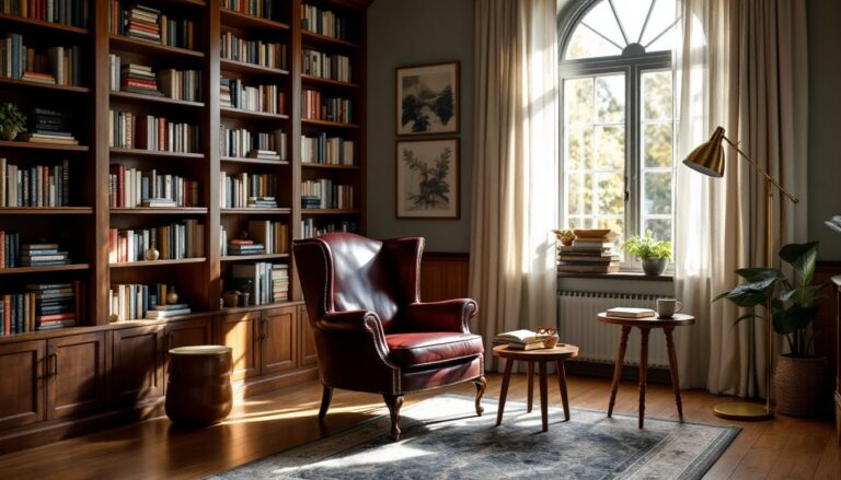
Too many wood tones is the #1 unity killer. Mixing oak flooring, cherry cabinets, walnut furniture, and pine trim creates a visual pileup. Stick to two wood tones maximum, one dominant (flooring, cabinetry), one accent (furniture, shelving). If you inherit mismatched wood, consider staining or painting trim to unify.
Ignoring undertones wrecks color unity. A “gray” paint with blue undertones clashes with “gray” tile that skews green. When selecting finishes, compare samples side-by-side under the same lighting. Use a white reference card to see undertones clearly, hold it next to your sample and note if the sample looks warm (yellow/red) or cool (blue/green) by comparison.
Random accent colors break cohesion. If your palette is navy, cream, and gold, don’t suddenly introduce a magenta pillow because you like it. Every color should tie back to the established scheme. Neutrals (black, white, gray, wood tones) can be added freely, but saturated colors need to repeat.
Over-theming is unity’s evil twin. A beach house doesn’t need anchors, rope, and driftwood in every room. True unity comes from repeating abstract design elements, colors, shapes, textures, not literal motifs. Let the palette do the work: skip the nautical tchotchkes.
Inconsistent hardware is a subtle but noticeable break. Mixing brushed nickel knobs with oil-rubbed bronze pulls and chrome hinges looks unfinished. Choose one finish and use it for all cabinet hardware, door levers, and bathroom fixtures in connected spaces. Exceptions: decorative statement pieces like a vintage brass chandelier can break the rule if they’re focal points.
Ignoring scale and proportion disrupts unity even when colors match. An oversized sectional in a 10′ × 12′ room, or a tiny rug floating in a large living area, throws off visual balance. Furniture should fit the room’s scale, and area rugs should extend at least 18″–24″ beyond furniture edges (front legs of sofas and chairs should rest on the rug).
Skipping a plan is the root cause of most unity failures. DIYers who buy piecemeal, a rug here, a paint color there, without an overarching scheme end up with a collection of nice items that don’t talk to each other. Before purchasing, create a mood board (digital or physical) with paint swatches, fabric samples, and finish samples. Free tools like Homedit’s galleries provide visual references for cohesive palettes.