Pattern is the secret weapon that separates flat, forgettable rooms from spaces with depth and personality. It’s what catches the eye when someone walks into a living room and thinks, “This place feels intentional.” Unlike color or texture, which work more subtly, pattern demands attention, but when used right, it guides the eye, defines zones, and adds rhythm to a space without screaming for it. Whether it’s a striped rug anchoring a dining table or wallpaper that makes a powder room memorable, pattern is a tool every homeowner should learn to wield with confidence.
Table of Contents
ToggleKey Takeaways
- Pattern in interior design adds visual depth, personality, and intentional rhythm to spaces while serving practical purposes like hiding wear in high-traffic areas.
- Understanding pattern categories—geometric, organic, and floral—allows homeowners to mix them effectively using scale variation, color cohesion, and type balance.
- Apply the 60-30-10 rule when combining patterns: use a dominant pattern for 60% of the space, a secondary pattern for 30%, and an accent pattern for just 10% to avoid visual chaos.
- Start incorporating pattern in low-risk, replaceable areas like rugs, pillows, and throws before committing to permanent solutions like wallpaper, tile, or upholstered furniture.
- Avoid common pattern mistakes such as matching everything identically, ignoring scale proportions, overcrowding small spaces, and choosing trends over personal preference for long-lasting design success.
What Is Pattern in Interior Design and Why Does It Matter?
Pattern refers to any repeating motif or design element on a surface, wallpaper, fabric, tile, rugs, even painted wall treatments. It’s one of the seven foundational principles of interior design, right alongside balance, contrast, and scale. Pattern adds visual movement and breaks up monotony in ways that solid colors can’t.
From a practical standpoint, pattern also hides wear. A geometric runner in a hallway camouflages dirt better than a solid. A floral duvet cover won’t show every wrinkle the way plain linen does. In high-traffic areas or homes with kids and pets, that’s a real advantage.
Beyond function, pattern establishes style faster than almost anything else. Stripes read preppy or nautical. Paisleys skew traditional. Bold geometrics signal modern confidence. The patterns chosen, and how they’re combined, tell a story about the space and the people in it. Interior design professionals use pattern to create focal points, direct sight lines, and establish hierarchy within a room. The same principles apply to DIY projects.
Types of Patterns Every Homeowner Should Know
Understanding pattern categories makes it easier to mix them effectively. Most patterns fall into a few basic families, each with distinct visual behavior.
Geometric Patterns
Geometric patterns use shapes, stripes, chevrons, hexagons, grids, plaids, lattice, and more. They’re structured, predictable, and tend to feel modern or crisp. Stripes are the most versatile: vertical ones elongate walls, horizontal ones widen spaces, and varying stripe widths add energy without chaos. Chevrons and herringbone bring directional movement, useful for guiding the eye toward architectural features or away from problem areas. Grid patterns (think windowpane checks or graph paper prints) add order and work well in modern Art Deco interiors where symmetry and geometry are celebrated.
Geometric patterns scale well. Small-scale geometrics (tiny polka dots, thin pinstripes) read almost like texture from a distance. Large-scale geometrics (oversized hexagon tile, wide awning stripes) make bold statements and work best when they’re the dominant pattern in a space.
Organic and Floral Patterns
Organic patterns pull from nature, florals, vines, leaves, animal prints, abstract watercolor effects, or any freeform, flowing motif. They tend to feel softer and more traditional than geometrics, though contemporary interpretations (like oversized monstera leaf prints or abstracted botanicals) skew modern.
Floral patterns range from tiny ditsy prints to cabbage-rose chintz. Scale matters enormously here. A large-scale floral on curtains or an accent wall creates drama: the same print at small scale becomes background texture. Organic patterns pair well with natural materials, linen, jute, wood, stone, and they’re a go-to for softening industrial interiors that might otherwise feel too hard-edged.
Animal prints (leopard, zebra, cowhide) are technically organic but behave like neutrals when used in moderation. A single leopard-print pillow or a cowhide rug grounds a room without reading as loud as you’d expect.
How to Mix Patterns Without Overwhelming Your Space
Mixing patterns successfully comes down to three variables: scale, color palette, and pattern type. Vary at least two of these three, and the mix will feel intentional rather than chaotic.
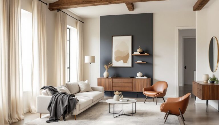
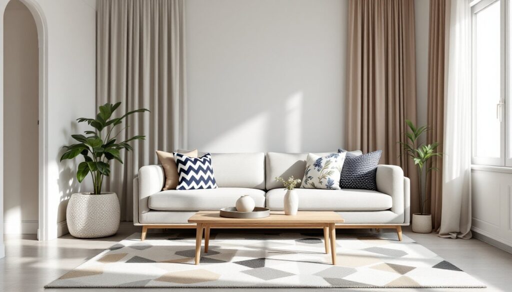
Scale variation is the most reliable trick. Pair a large-scale pattern (like bold floral wallpaper) with a medium-scale pattern (like a plaid throw) and a small-scale pattern (like a ticking-stripe pillow). When all three patterns share a similar size, they compete for attention and the room feels busy. Designers often use the 60-30-10 rule as a rough guide: 60% of the pattern comes from the dominant piece (rug, wallpaper, or upholstery), 30% from a secondary pattern, and 10% from an accent.
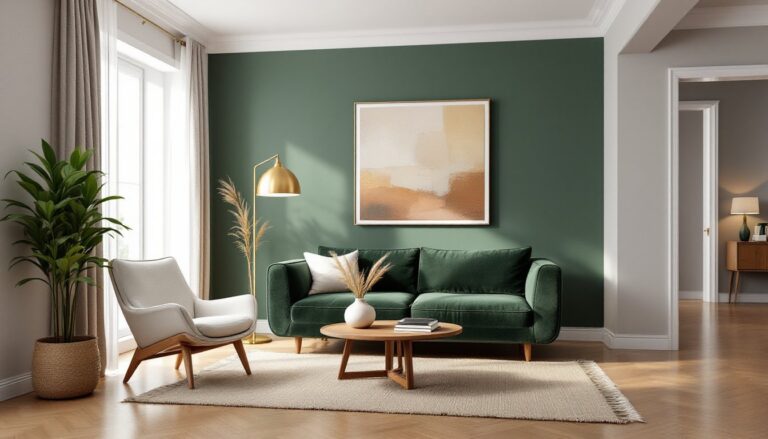
Color cohesion is the second anchor. Pull all patterns from the same palette, even if the motifs are wildly different, and they’ll hang together. A room with navy-and-white stripes, a navy-and-cream geometric, and a soft blue floral works because the color story is consistent. Neutrals (black, white, gray, beige, tan) act as bridges and give the eye places to rest.
Pattern type mixing is where personality comes in. Combine one geometric with one organic pattern as a baseline, then layer in a third if desired. For example: a striped area rug (geometric), floral curtains (organic), and a solid sofa with a small geometric-print pillow. This approach shows up frequently in cozy interior design, where layering different textures and patterns creates warmth without clutter.
One more rule: solids are patterns, too. Don’t forget to give the eye a break. Solid-colored walls, furniture, or bedding act as visual breathing room and let the patterns you do use shine.
Where to Introduce Pattern in Your Home
Pattern works anywhere, but some applications are easier to commit to than others. Start with the low-risk, high-impact spots.
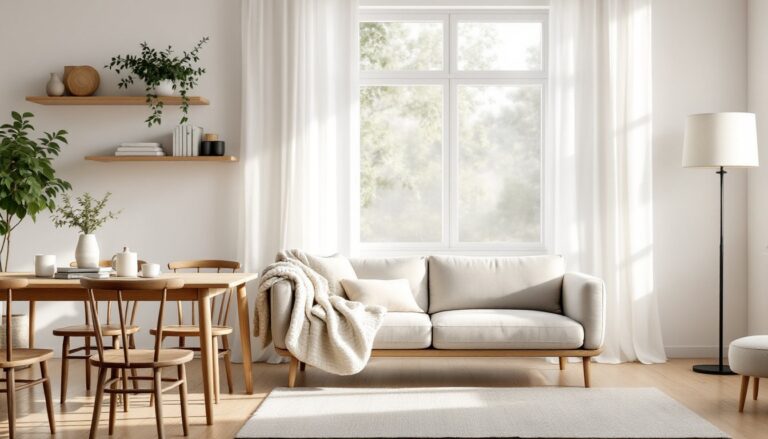
Rugs are the safest entry point. A patterned area rug anchors a seating area, defines a dining zone, or adds punch to a bedroom without touching a single wall. Rugs are also replaceable and relatively affordable compared to reupholstering a sofa. Geometric or vintage-style rugs are popular in condo interior design because they add character to smaller footprints without overwhelming limited square footage.
Pillows and throws offer flexibility. Swapping out pillow covers seasonally or when tastes change is easy and inexpensive. Mix two or three different patterns on a sofa or bed, keeping the color palette consistent.
Window treatments introduce pattern at eye level and above, which draws the gaze upward and makes ceilings feel higher. Patterned curtains or Roman shades work especially well in rooms with plain walls. Lining patterned curtains with blackout fabric adds function to form in bedrooms.
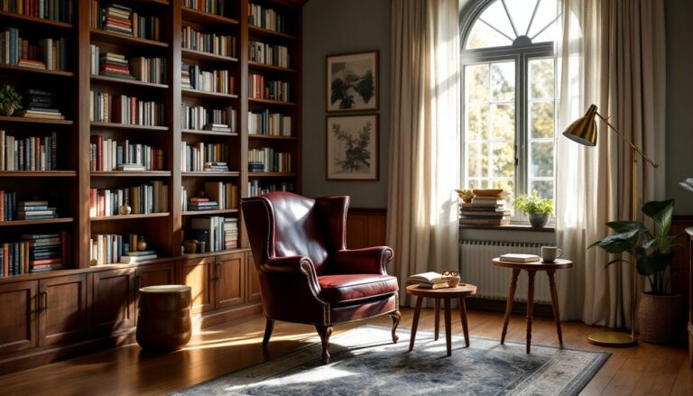
Wallpaper is the highest-commitment option, but it delivers maximum impact. Feature walls (the wall behind a bed, inside a bookcase, or in a powder room) are less intimidating than wrapping an entire room. Peel-and-stick wallpaper has made experimentation easier, it’s removable, renter-friendly, and doesn’t require paste or a booking table. According to House Beautiful, wallpaper has seen a major resurgence as homeowners look for ways to personalize spaces quickly.
Tile is permanent and works beautifully in kitchens, bathrooms, mudrooms, and entryways. Patterned cement tile or encaustic tile can define a backsplash, a shower niche, or a hallway floor. Because tile is a structural finish, it’s worth getting installation right, this is one area where hiring a pro makes sense if levelness and waterproofing matter (and they do).
Upholstery is the boldest move. A patterned sofa or armchair becomes the room’s focal point. If commitment is an issue, try a patterned headboard, dining chairs, or an ottoman first. Upholstery-weight fabric typically ranges from 54 to 60 inches wide and should have a double-rub count of at least 15,000 for residential use (higher for high-traffic pieces).
Common Pattern Mistakes to Avoid
Even experienced DIYers trip up on pattern. Here’s what to watch for.
Matching everything is the most common error. A sofa, curtains, and pillows all in the same fabric looks more like a showroom display than a lived-in home. Mix it up, use that fabric once, then pull in complementary patterns elsewhere.
Ignoring scale leads to visual clutter. Three medium-scale patterns in the same sight line blur together. Vary the size so each pattern has breathing room and a distinct role.
Skipping the color test is a rookie move. Patterns that look great in isolation can clash when placed side by side. Lay fabric swatches or sample tiles out in the actual room, in natural light, before committing. Paint and tile stores will usually loan samples or sell small quantities for testing. Many design enthusiasts on Reddit’s interior design communities share tips on how to request samples and test combinations at home before buying.
Overcrowding small spaces with large-scale or high-contrast patterns can make rooms feel smaller. That doesn’t mean small rooms can’t handle pattern, just keep the scale proportional or use pattern strategically (one wall, the rug, or window treatments, not all three).
Forgetting the ceiling and floor as pattern opportunities is a missed chance. A painted or papered ceiling (sometimes called the “fifth wall”) or a bold floor tile pattern adds unexpected interest. Just keep in mind that floor patterns need to be durable and forgiving, high-gloss tile shows every footprint, while matte or textured finishes hide traffic better.
Neglecting the 60-30-10 rule or some version of visual hierarchy results in a space where nothing stands out because everything is shouting. Decide which pattern is the star, which is the supporting actor, and which is the cameo. The same principle applies when balancing interior architecture versus interior design, structure and style need clear roles.
Finally, don’t let trends override personal preference. According to Design Milk, pattern trends shift every few years, from maximalist florals to minimalist line drawings. Choose patterns that resonate personally, especially for permanent installations like tile or built-in upholstery. Trends fade, but a well-executed pattern mix grounded in solid design principles holds up for years.