A logo isn’t just a pretty mark, it’s the visual handshake that tells potential clients who you are before they step through the door. For interior designers, it’s even more critical: your logo needs to communicate style, professionalism, and creative vision in a single glance. Whether you’re a homeowner launching a side hustle in staging or a design enthusiast building a portfolio, the right logo sets the tone for everything that follows. It’s not about chasing trends or hiring an expensive agency. With the right approach and tools, anyone can create a brand mark that’s polished, memorable, and authentically theirs.
Table of Contents
ToggleKey Takeaways
- A strong interior design logo communicates professionalism and creative vision at a glance, directly affecting how clients perceive your credibility and trust in your brand.
- Interior design logos must prioritize simplicity and scalability to remain clear across all applications, from business cards to social media profiles to vehicle wraps.
- Color psychology and font selection are strategic decisions—choose navy or warm tones paired with timeless typefaces rather than trendy options that will quickly feel dated.
- Monogram, iconic symbol, and minimalist geometry styles dominate 2026 interior design logos, with geometric shapes and abstract architectural elements proving most effective for multi-platform use.
- DIY logo design tools like Canva, Adobe Express, and Affinity Designer make professional interior design logos accessible without expensive agency fees or graphic design experience.
- Always export your logo in multiple formats (PNG, JPG, SVG, EPS) and test it in black and white to ensure it works across all real-world applications like embroidery and printing.
Why Your Interior Design Logo Matters More Than You Think
Your logo shows up everywhere, business cards, invoices, social media headers, and proposal PDFs. It’s the anchor of your visual identity, and it directly affects how clients perceive your credibility. A sloppy or generic logo signals amateur work, even if your design portfolio is stellar.
Consistency matters. A well-designed logo helps you maintain a cohesive brand across platforms, from Instagram to your email signature. It makes your work instantly recognizable, which builds trust over time. Think of it as the visual equivalent of a firm handshake.
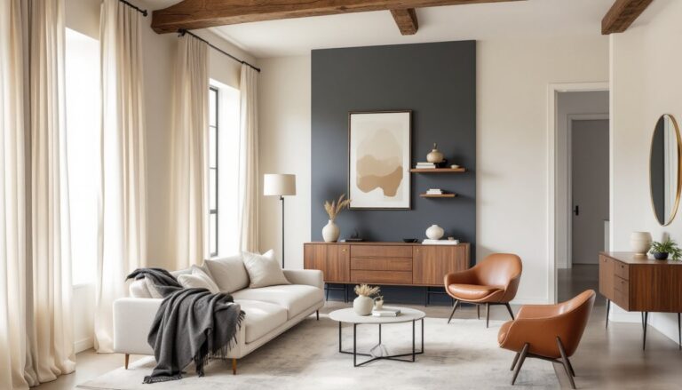
For designers working in competitive markets, a strong logo differentiates you from the pack. If you specialize in Modern Art Deco Interior or Industrial Interior Design, your logo should hint at that aesthetic. It’s not about being loud, it’s about being clear and intentional with your visual messaging.
Essential Elements of Effective Interior Design Logos
Every successful logo shares a few core traits: simplicity, scalability, and relevance. Start with a clean, uncluttered design. Overly complex logos lose detail when scaled down to a favicon or watermark. Aim for a mark that reads clearly at 1 inch square and looks sharp at 10 feet.
Scalability is non-negotiable. Test your logo at multiple sizes, business card, website header, vehicle wrap. If fine lines or intricate details disappear at small sizes, simplify. Vector formats (AI, EPS, SVG) are essential: they scale infinitely without pixelation.
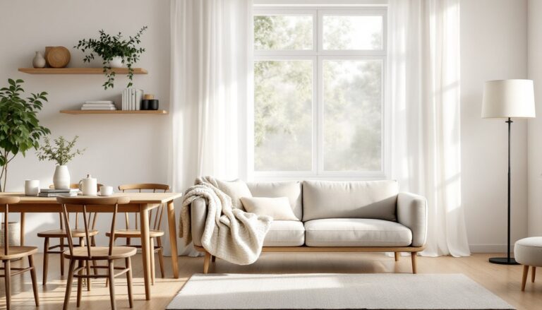
Relevance ties your logo to your niche. If you focus on cozy interior design, soft curves and warm tones make sense. For minimalist or contemporary work, lean toward geometric shapes and restrained palettes. Your logo should feel like an extension of the spaces you create.
Color Psychology and Font Selection
Color choice isn’t arbitrary, it triggers psychological responses. Navy and charcoal convey professionalism and stability. Blush pink and sage green suggest approachability and comfort. Gold or brass accents signal luxury. Choose 2-3 colors max to avoid visual clutter.
Font selection deserves equal attention. Serif fonts (like Playfair Display or Baskerville) feel classic and refined. Sans-serif options (Futura, Montserrat) read as modern and clean. Script fonts can work for boutique designers, but they often sacrifice legibility, especially at small sizes. Pair a decorative font with a simple sans-serif for balance.
Avoid trendy fonts that’ll look dated in two years. Your logo needs longevity. Stick with typefaces that feel timeless, and ensure they’re licensed for commercial use. Free fonts often have restrictions that’ll bite you later.
Popular Logo Styles for Interior Designers in 2026
Monogram logos remain a favorite among designers. They’re compact, elegant, and work well across platforms. A stylized set of initials in a custom typeface feels personal without being fussy. This style suits solo practitioners and boutique firms equally well.
Iconic symbols are gaining traction, think stylized floor plans, abstract furniture silhouettes, or architectural line drawings. These work best when paired with clean typography. The icon adds visual interest, while the wordmark ensures clarity. Just avoid clichés like generic house outlines or sofa clip art.
Wordmark-only logos are trending for designers with memorable business names. A custom typeface or ligature treatment can turn a simple name into a distinctive mark. This approach works especially well for designers whose services focus on condo interior design or other niche markets where clarity trumps decoration.
According to design platforms like Houzz, minimalist geometry continues to dominate, circles, triangles, and intersecting lines that suggest structure and balance. These shapes scale beautifully and print cleanly, making them practical choices for multi-platform branding.
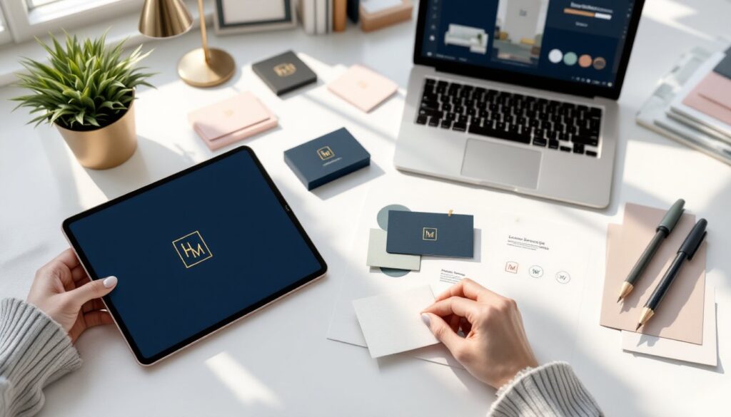
DIY Logo Design: Tools and Resources for Homeowners
You don’t need a degree in graphic design or a five-figure budget to create a professional logo. Canva offers drag-and-drop templates specifically for interior designers, with built-in brand kits to keep colors and fonts consistent. The free version works fine for most projects, but the Pro tier ($120/year) unlocks transparent PNGs and better export options.
Adobe Express (formerly Spark) provides similar functionality with smoother integration into the Adobe ecosystem. If you’re already paying for Creative Cloud, it’s included. The template library is extensive, though you’ll need to customize heavily to avoid looking like every other designer on the block.
For more control, try Looka or Hatchful. Both use AI to generate logo variations based on your style preferences and industry. You’ll answer a few questions, then refine the output. Pricing runs $20-$65 for a full package with vector files and brand guidelines, reasonable for a starter logo.
If you want total creative freedom, Affinity Designer ($70 one-time purchase) is a budget-friendly alternative to Adobe Illustrator. It’s vector-based, supports all professional file formats, and has a gentler learning curve. Pair it with free resources from MyDomaine for design inspiration and color palette ideas.
Pro tip: Always export your logo in multiple formats, PNG (with transparent background), JPG (for print), SVG (for web scalability), and EPS or AI (for professional printing). Your sign maker or printer will thank you.
Common Logo Design Mistakes to Avoid
The biggest mistake is over-complicating the design. Gradients, drop shadows, and multiple fonts might look impressive on your monitor, but they’ll fail in real-world applications. A logo needs to work in one color (think embroidery or foil stamping), so test a black-and-white version before you commit.
Another pitfall: choosing colors based on personal preference rather than strategic thinking. Your favorite color might not align with your brand positioning. If you’re building an interior design portfolio targeting high-end clients, neon lime probably won’t cut it, no matter how much you love it.
Ignoring legibility is a close third. Designers often fall in love with decorative script fonts that are gorgeous at 72pt but illegible at 12pt. If your clients can’t read your business name on a website footer or email signature, you’ve failed the first test.
Skipping the trademark search can cost you down the line. Before finalizing your design, run a basic search through the USPTO database (for U.S.-based designers) to ensure you’re not infringing on existing marks. It’s not a replacement for a legal opinion, but it’s a smart first step.
Finally, don’t neglect file organization. Save your working files with clear version numbers and keep a master folder with all formats. When you need to send a logo to a printer at 9 PM before a trade show, you’ll be glad you did.
Where and How to Use Your Interior Design Logo
Your logo belongs on every client-facing touchpoint. Start with the essentials: business cards, letterhead, and email signatures. Use the full-color version for digital applications and a simplified one-color version for print when budget or format requires it.
Digital platforms demand flexibility. Your logo needs to work as a square profile image on Instagram, a horizontal banner on LinkedIn, and a circular avatar on Pinterest. Design with these constraints in mind, or create adaptable variations (a logomark for square crops, a full wordmark for horizontal spaces).
Physical applications include project signage, vehicle wraps (if you’re scaling up), and product packaging for designers who sell curated decor items. For staging professionals offering interior styling services, yard signs and banners at open houses provide valuable visibility.
Watermark your portfolio images lightly in one corner, enough to claim ownership without distracting from the work itself. Interior design inspiration sites like Homedit showcase thousands of portfolios: a subtle, consistent watermark helps your work stay attributed as it circulates.
Pro tip: Create a brand style guide (even a simple one-pager) that specifies logo placement rules, minimum size, clear space, and approved color variations. This keeps your branding consistent whether you’re designing a flyer yourself or handing assets off to a printer.