Designing an ice cream shop isn’t just about scooping out flavors, it’s about crafting an experience that draws customers in and keeps them coming back. The right interior design transforms a simple storefront into a destination, balancing functional needs like traffic flow and sanitation with aesthetic appeal that reflects the brand’s personality. Whether converting a former retail space or building from scratch, every choice, from flooring materials to ceiling height, affects operations, customer comfort, and profitability. This guide breaks down the essential elements to consider when designing an ice cream shop interior that works as hard as it looks.
Table of Contents
ToggleKey Takeaways
- Ice cream shop interior design directly impacts customer dwell time and sales by creating a welcoming environment that encourages longer visits and additional purchases.
- Strategic color schemes—from pastels for nostalgia to bold saturated hues for urban locations—combined with layered lighting and proper display case illumination significantly enhance both ambiance and product appeal.
- Optimized layout and flow, starting with a clear sightline to the menu board within three steps and queue placement parallel to display cases, improve service speed and customer satisfaction during peak hours.
- Material selection must balance durability with aesthetics, using commercial-grade porcelain tile, sealed concrete, or quartz countertops to withstand high-traffic conditions while maintaining cleanliness standards.
- Intentional design features like mural walls, three-dimensional installations, and Instagram-worthy seating spots leverage social media visibility and drive foot traffic through organic location tagging and customer sharing.
Why Interior Design Matters for Ice Cream Shops
First impressions happen fast in retail food service. A well-designed interior signals quality before a customer ever tastes a product. For ice cream shops specifically, the space needs to communicate cleanliness, fun, and efficiency, often simultaneously.
Customer dwell time directly impacts sales. Thoughtful seating arrangements, visual interest, and comfortable temperature control encourage longer visits and additional purchases. A cramped, poorly lit space pushes people out the door with a single cone. A welcoming environment invites families to linger, groups to gather, and solo customers to settle in with a sundae.
Brand differentiation matters in saturated markets. Generic white tile and fluorescent strips don’t cut through the noise. The interior should reinforce what makes the shop unique, whether that’s artisanal small-batch production, nostalgic Americana, or bold modern experimentation. Every surface, fixture, and finish contributes to that narrative.
Operational efficiency lives in the details. Counter height, serving station layout, and storage accessibility affect staff workflow and service speed during rush periods. Poor design decisions create bottlenecks that frustrate employees and slow throughput during peak hours when every minute counts.
Essential Design Elements for Ice Cream Shop Interiors
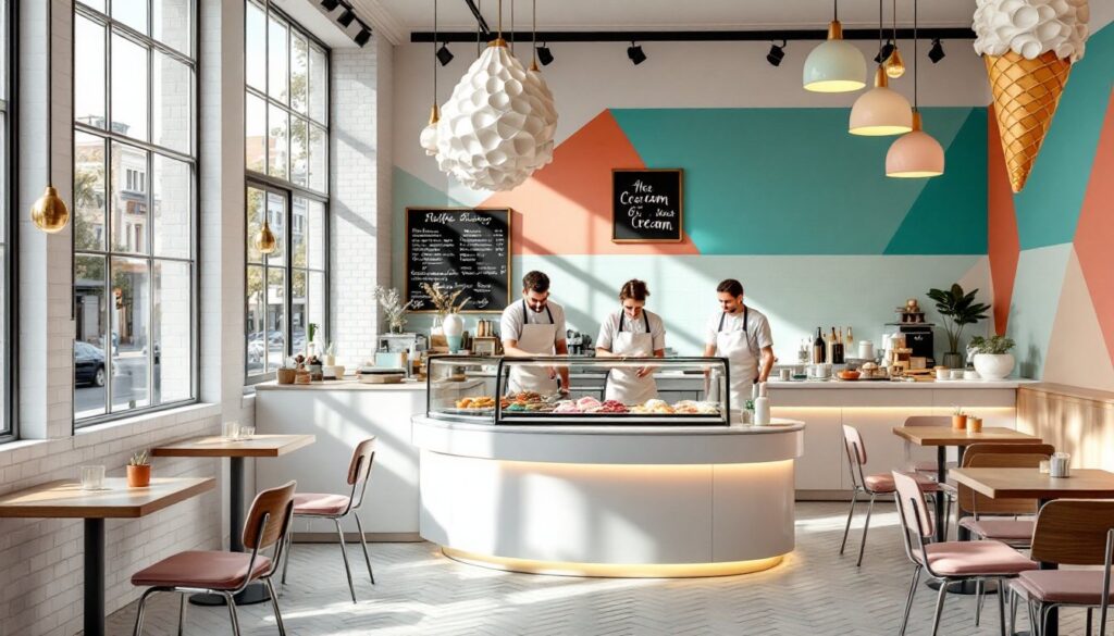
Color Schemes That Capture the Ice Cream Experience
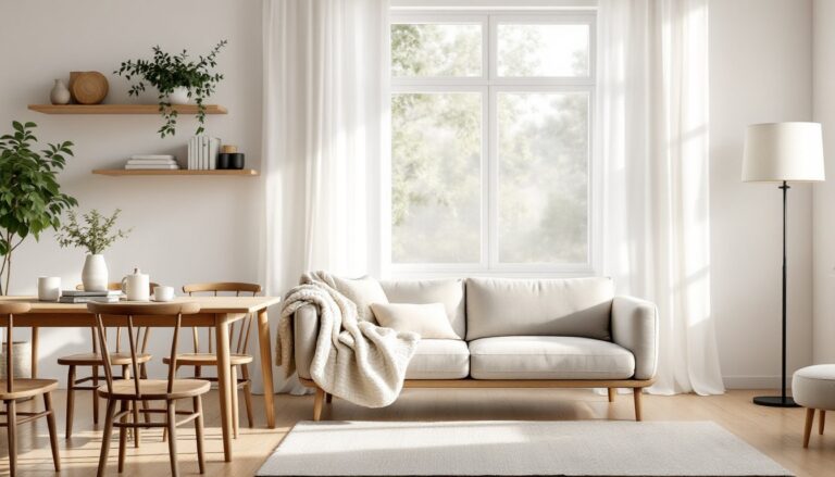
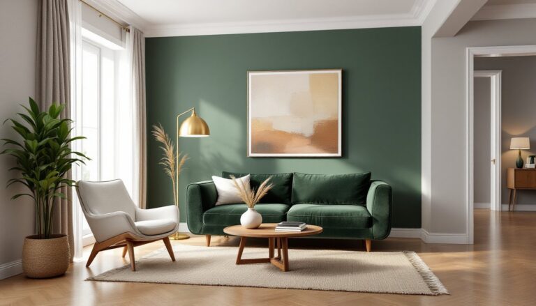
Color psychology plays a significant role in food retail. Pastels, soft pinks, mint greens, buttery yellows, evoke classic ice cream parlor nostalgia and create a gentle, approachable atmosphere. These hues work particularly well for family-oriented shops or brands emphasizing traditional recipes.
Bold, saturated colors make a statement in high-traffic urban locations. Bright turquoise, hot pink, or sunny orange grab attention from passing foot traffic and photograph exceptionally well for social media. Pair these with crisp white trim to keep the space from feeling chaotic.
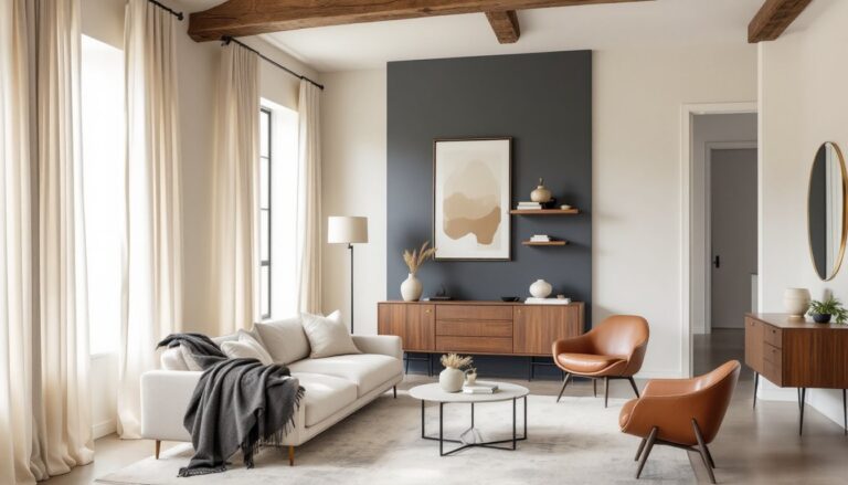
Neutral bases with accent pops offer flexibility. White subway tile, natural wood tones, or light gray walls provide a clean backdrop that lets product displays and branding elements stand out. Add color through removable elements like signage, menu boards, or seasonal décor that can be refreshed without major renovation.
Consider how colors interact with your lighting plan. Cool fluorescents can make warm pastels look dingy, while warm LEDs enhance cream tones and wood finishes. Test paint samples under your actual lighting conditions before committing to large areas.
Lighting Techniques to Enhance Ambiance and Product Display
Layered lighting creates depth and visual interest. Combine ambient overhead fixtures with task lighting at service counters and accent lighting to highlight product displays or architectural features. A single ceiling fixture grid flattens the space and creates harsh shadows.
Display case lighting demands special attention. LED strips with high Color Rendering Index (CRI 90+) make ice cream colors appear true and appetizing. Poor lighting turns vibrant strawberry into muddy brown and makes pistachio look gray. Position lights to eliminate glare on glass while illuminating product from multiple angles.
Natural light boosts mood but requires careful management. Large windows create an inviting street presence but introduce heat gain that fights your refrigeration systems. Use UV-filtering window film, exterior awnings, or strategic placement of display cases away from direct sun exposure.
Dimmer switches provide operational flexibility. Bright task lighting works for morning prep and closing cleanup, while softer ambient levels create a relaxed evening atmosphere. Install dimmers on separate circuits for ambient and task zones to maintain proper work lighting at service areas while adjusting dining space mood.
Decorative fixtures reinforce brand identity. Vintage pendant lights suit retro concepts, industrial cage fixtures complement exposed brick and metal, and colorful modern pendants work for contemporary spaces. Just ensure they meet local food service codes for cleanability and don’t interfere with ventilation requirements.
Layout and Flow: Optimizing Customer Experience
Customer flow starts at the entrance. The entry should provide a clear sightline to the menu board and service counter within three steps. Confused customers block the doorway and create congestion during busy periods. Position the ordering queue to run parallel to display cases, letting people browse flavors as they wait.
Counter placement affects service speed and customer interaction. A straight counter maximizes efficiency for high-volume operations, while an L-shaped or curved counter creates more face-to-face interaction for shops emphasizing personal service. Allow 42-48 inches of clearance behind the counter for staff movement, more if multiple employees work simultaneously.
Seating zones need deliberate planning. Separate high-turnover counter seating from table areas meant for lingering. Position family-friendly booths or larger tables near the back, away from the ordering flow. Solo customers and couples often prefer counter seats with street views. Each seat should have access to trash and napkin stations without crossing service paths.
ADA compliance isn’t optional. Ensure 36-inch minimum clear paths throughout the space, accessible counter sections at 34 inches maximum height, and properly sized accessible seating. Many jurisdictions require accessible routes to all public areas including outdoor patios. Verify requirements with your local building department before finalizing layouts.
Storage and prep areas deserve as much planning as customer-facing space. Dry storage for cones, cups, and toppings should be within a few steps of the serving counter. Sink placement must meet health code spacing requirements from food prep and service areas. Inadequate back-of-house planning creates constant inefficiency that compounds over thousands of transactions.
Materials and Finishes That Balance Durability with Style
Flooring takes constant abuse in ice cream shops. Spills, foot traffic, and frequent mopping demand surfaces that withstand moisture without becoming slippery. Porcelain tile rated for commercial use offers excellent durability and comes in countless styles from classic subway to wood-look planks. Ensure slip resistance ratings meet local health code requirements, typically a DCOF rating of 0.42 or higher for wet areas.
Sealed concrete provides an industrial-modern aesthetic with exceptional durability. Stained or polished concrete handles traffic well and simplifies cleanup, though it’s unforgiving on dropped glassware and can be cold underfoot. Use anti-slip additives in the sealer for safety. Avoid luxury vinyl plank in high-traffic areas, it doesn’t hold up to commercial use even though residential popularity.
Wall surfaces need to balance cleanability with visual warmth. Full-height ceramic tile in service and prep areas satisfies health inspectors and wipes clean instantly. In dining areas, washable paint with semi-gloss or satin finish handles occasional splatter while maintaining a less institutional feel. Design-forward spaces often combine materials, tile wainscoting topped with painted drywall or wood accent walls sealed for protection.
Countertop materials face intense scrutiny from health departments. Solid surface materials like Corian or quartz offer seamless, non-porous surfaces that meet food service codes. Avoid grout lines in work surfaces where bacteria can harbor. If using tile for aesthetic reasons, specify epoxy grout and seal it properly.
Ceiling treatments often get overlooked but impact both acoustics and cleanability. Exposed ductwork suits industrial concepts but requires regular cleaning to prevent dust buildup. Acoustic ceiling tiles control noise in hard-surfaced spaces but must be washable or easily replaced. Many shops use painted drywall ceilings with sound-dampening panels strategically placed as design elements rather than full coverage.
Creating Instagram-Worthy Moments with Signature Design Features
Social media visibility drives foot traffic for modern ice cream shops. Designated photo opportunities don’t happen by accident, they require intentional design. A signature wall feature gives customers a reason to share and tags your location organically.
Mural walls deliver maximum impact. Commission local artists to create custom murals that reflect neighborhood character or brand personality. Bold graphics, playful typography, or illustrated scenes work well. Position murals where natural light enhances photography without creating harsh shadows. Leave floor space clear in front of the mural, about 4-5 feet, so groups can pose without blocking traffic.
Three-dimensional installations create depth that photographs well. Oversized waffle cones suspended from ceilings, neon signage with clever phrases, or sculptural seating elements give customers multiple share-worthy moments throughout the space. Featured ice cream shop designs often incorporate these playful elements as brand differentiators.
Color-blocking and pattern play photograph exceptionally well. Geometric floor tiles, striped walls, or ombré paint treatments create visual interest that pops on small screens. Contrast is your friend, pair dark and light values for definition rather than subtle tone-on-tone schemes that flatten in photos.
Seating doubles as design when done right. Vintage diner stools, swing seats, or custom-built benches with interesting shapes become part of the photo. Ensure Instagram-friendly seating is structurally sound and meets safety codes, whimsical doesn’t mean flimsy.
Lighting sets the mood for photography. Avoid harsh overhead-only lighting that creates unflattering shadows on faces. Softer, diffused lighting or strategically placed accent lights create the flattering glow that encourages selfies. Some shops install ring lights near popular photo spots, acknowledging and facilitating the behavior rather than fighting it.
Consider how elements read through a phone camera. What looks perfect in person might photograph poorly. Test mockups with smartphone cameras during the design phase. Small details get lost, but bold shapes, strong color contrasts, and clear text remain legible when compressed for social feeds.