Mid century modern isn’t just another design trend that’ll fade with the next Instagram algorithm shift. It’s the rare aesthetic that’s been holding strong since the 1940s, and for good reason: clean lines, honest materials, and furniture that actually functions. Unlike some decorating styles that demand a full gut-and-remodel commitment, mid century design works in rentals, starter homes, and century-old Craftsmen alike. Whether someone’s furnishing their first apartment or refreshing a living room that’s been stuck in 2009, this style offers a practical roadmap that doesn’t require a contractor’s license or a trust fund.
Table of Contents
ToggleKey Takeaways
- Mid century interior design emerged between 1945 and 1969, prioritizing clean lines, honest materials, and functional forms over ornamental excess.
- The style works in any home type and budget level—start with one statement furniture piece like a credenza or lounge chair to establish mid century principles without a complete overhaul.
- Authentic mid century design relies on exposed legs (4–6 inches off the ground), tapered furniture profiles, and natural wood finishes to create visual breathing room and horizontal emphasis.
- Earthy neutrals form the foundation (warm walnut, teak, soft grays), while accent colors like burnt orange, avocado green, and teal bring period authenticity when used sparingly.
- Common mistakes—mixing conflicting eras, over-accessorizing, hiding wood grain under paint, and skipping proper lighting layers—undermine the uncluttered, airy quality that makes mid century design timeless.
What Is Mid Century Interior Design?
Mid century interior design emerged between roughly 1945 and 1969, born from post-war optimism and new manufacturing techniques. The style stripped away Victorian fussiness and Art Deco excess in favor of simplicity and function. Designers like Charles and Ray Eames, Eero Saarinen, and George Nelson believed good design should be accessible, not just for the wealthy.
The movement coincided with suburban expansion and the rise of open floor plans. Homes needed furniture that could define spaces without blocking sightlines. That’s why mid century pieces tend to sit low to the ground and feature exposed legs that create visual breathing room.
At its core, this style celebrates honesty: plywood looks like plywood, teak looks like teak, and bent steel doesn’t pretend to be wrought iron. It’s the opposite of applied ornamentation. If a joint shows, it’s often intentional, part of the design language rather than something to hide behind molding.
Key Characteristics of Mid Century Modern Style
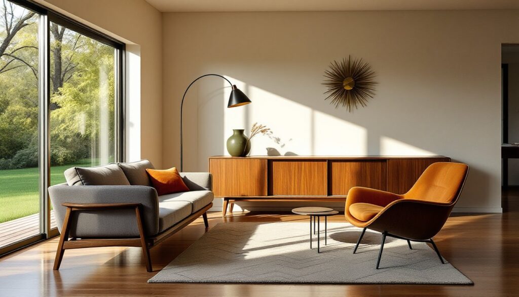
Clean, uncluttered lines define the aesthetic. Furniture profiles are geometric but not harsh, think gentle curves on chair backs and tapered legs that angle outward. Nothing’s overstuffed or skirted. Sofas typically feature exposed wooden frames, and cabinet hardware is minimal or integrated.
Organic and geometric forms blend together. A kidney-shaped coffee table might sit beneath a starburst wall clock. Designers borrowed shapes from nature, leaf motifs, bent plywood that mimics the human spine, but rendered them in modern materials like molded plastic and fiberglass.
Function drives form, not the other way around. Storage units serve as room dividers. Chairs stack or nest. Murphy beds fold into credenzas. The era’s designers obsessed over multi-use pieces because post-war homes were smaller than their pre-Depression counterparts, and families needed furniture that earned its square footage.
Indoor-outdoor connection matters. Floor-to-ceiling windows, sliding glass doors, and rooms that open onto patios weren’t just architectural whims, they were integral to the philosophy. Bringing natural light and greenery inside blurred the boundaries between landscape and living space.
Minimal ornamentation appears intentional. When decoration shows up, it’s usually in the form of the material itself: the grain pattern in a walnut sideboard, the weave of a Danish cord seat, or the texture of a nubby wool rug. Trim and molding are sparse. Walls stay flat and smooth.
Essential Furniture Pieces for Mid Century Spaces
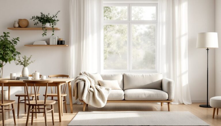
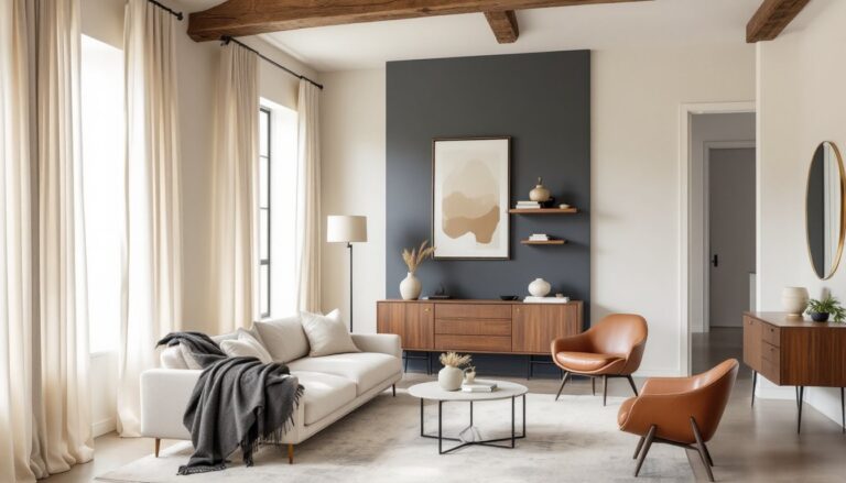
A low-profile sofa with tapered wooden legs sets the foundation. Look for pieces with tight seat cushions and simple track arms or slightly flared sides. Avoid tufting, nailhead trim, or skirts. Many modern interpretations feature performance fabrics in period-appropriate textures.
Platform beds replaced bulky bed frames. The mattress sits directly on a slatted base or low box, eliminating the need for a box spring. Headboards, if present, are usually floating panels of teak or walnut.
Credenzas and sideboards do the heavy lifting for storage. These low, horizontal cabinets often feature sliding doors, tapered legs, and interior dividers designed for vinyl records or serving ware. They work as TV stands, dining room buffets, or entryway consoles.
Molded plastic or fiberglass shell chairs represent the era’s embrace of new materials. Eames shells, Tulip chairs, and Panton S-chairs became icons. Wire chairs with vinyl seat pads offer a similar vibe at lower cost.
Teak or walnut dining tables with self-storing leaves were engineering marvels. The extension mechanism hides inside the frame, and the extra leaf tucks underneath the tabletop. Oval and rectangular shapes dominate, though round pedestal tables also appeared.
Accent chairs in organic shapes add visual interest. Lounge chairs with bent plywood frames, molded fiberglass rockers, or upholstered wingbacks with exposed wood legs become statement pieces without overwhelming smaller rooms.
Color Palettes and Materials That Define the Era
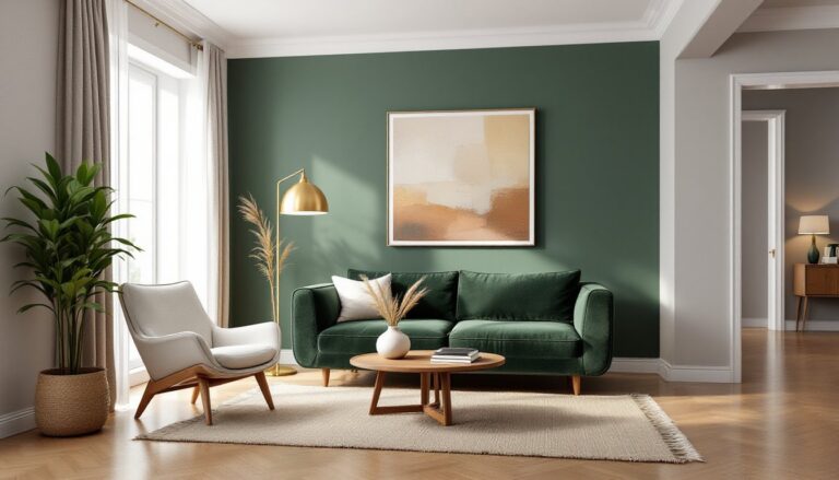
Earthy neutrals form the base: warm walnut and teak tones, off-whites, beiges, and soft grays. Walls were often painted in muted shades, sage, mustard, or pale blue, that complemented wood furniture rather than competing with it.
Accent colors pull from nature: burnt orange, avocado green, goldenrod yellow, and teal appear in upholstery, throw pillows, and wall art. These weren’t pastel interpretations, mid century hues carry saturation and depth. A single burnt orange chair in a neutral room creates impact without requiring a full palette commitment.
Wood species matter. Teak, walnut, and rosewood dominated high-end pieces due to their rich grain and natural oils that resist wear. Birch plywood and oak showed up in budget-friendly options. Avoid overly red or orange stains, authentic mid century finishes let the wood’s natural color show through with minimal tinting.
Metals add industrial contrast. Brushed brass, chrome, and powder-coated steel appear in light fixtures, chair legs, and cabinet pulls. The finish is usually matte or satin, not polished to a mirror shine.
Textiles favor natural fibers with texture. Wool bouclé, linen, and cotton twill upholster seating. Shag or low-pile wool rugs in geometric patterns anchor spaces. Avoid synthetics that look shiny or slick, the era prized tactile, honest materials even in fabrics.
How to Incorporate Mid Century Design in Your Home
Start with one statement furniture piece. A credenza, lounge chair, or dining table establishes the vocabulary without requiring a complete overhaul. Mix it with existing furniture, mid century design plays well with contemporary layouts and even some traditional pieces if the color palette aligns.
Declutter and edit ruthlessly. This style depends on negative space and clean surfaces. Remove decorative objects that don’t serve a purpose. Group items in odd numbers (three vases, five books) rather than symmetrical pairs.
Update lighting fixtures. Swap builder-grade ceiling fans and drum pendants for Sputnik chandeliers, arc floor lamps, or cone-shaped pendants in brass or matte black. Lighting defines the era as much as furniture does.
Choose low-sitting furniture to preserve sightlines. Even if existing pieces aren’t authentic mid century, selecting items under 32 inches tall (standard sofa back height) creates the horizontal emphasis that characterizes the style.
Embrace wood tones instead of painting everything. If existing trim or built-ins are solid wood, consider stripping paint to reveal the grain. Natural wood doesn’t have to match perfectly, teak chairs work fine with a walnut table as long as the undertones (warm vs. cool) align.
Add geometric patterns sparingly. A single rug with a bold chevron or starburst pattern, or throw pillows in an abstract print, brings period authenticity. Overdo it and the space reads more retro-kitsch than mid century.
Install floating shelves or open storage. Wall-mounted units in walnut or teak keep books and objects accessible while maintaining the airy, uncluttered feel. Avoid heavy bookcases that run floor-to-ceiling unless the room is large enough to handle the visual weight.
Consider architectural updates for long-term projects. Removing a wall to create an open floor plan, adding a sliding glass door, or installing floor-to-ceiling windows requires permits and often structural evaluation, but these changes deliver the most dramatic shift toward authentic mid century living.
Common Mistakes to Avoid When Going Mid Century
Mixing too many eras creates confusion. Mid century tolerates some eclectic layering, but adding French provincial chairs or distressed farmhouse tables muddies the aesthetic. Stick with pieces that share similar leg styles, clean lines, and minimal ornamentation.
Over-accessorizing kills the vibe. The style depends on restraint. A mantel crowded with tchotchkes or a coffee table buried under books and candles contradicts the uncluttered philosophy. Edit down to a few high-impact items.
Ignoring scale in small spaces backfires. A massive sectional or oversized credenza overwhelms rooms under 200 square feet. Measure carefully, mid century furniture was designed for modest homes, but reproductions sometimes scale up. Stick with pieces that leave at least 30 inches of walking clearance around them.
Painting wood furniture white or gray erases authenticity. If the grain and tone don’t suit the space, sell or donate the piece rather than covering it. Painted mid century furniture rarely looks intentional, it just looks like someone couldn’t commit.
Skipping the legs ruins the look. Furniture sitting flat on the floor or hidden behind skirts loses the airy, elevated quality that defines the style. Even affordable pieces benefit from tapered or hairpin legs that lift them 4 to 6 inches off the ground.
Choosing too-bright or too-saturated accent colors. Neon or primary brights weren’t part of the original palette. Opt for muted, earthy versions, burnt orange instead of traffic-cone orange, olive instead of lime green.
Neglecting lighting layers creates flat spaces. A single overhead fixture won’t cut it. Combine ambient (ceiling or pendant), task (arc or desk lamps), and accent (wall sconces or picture lights) sources to add depth. Many design enthusiasts layer at least three light sources per room.
Forcing the style into incompatible architecture. Mid century thrives in ranch homes, post-and-beam construction, and open layouts. Trying to shoehorn it into a Victorian with heavy molding and small, segmented rooms requires either significant architectural changes or a hybrid approach that borrows selectively rather than committing fully.
Conclusion
Mid century interior design endures because it solves real problems: how to make small spaces feel open, how to store belongings without visual clutter, and how to create comfort without sacrificing style. The principles, clean lines, functional forms, honest materials, translate across budgets and home types. Start with one quality piece, clear the clutter, and let the architecture breathe. The result feels timeless because it is.